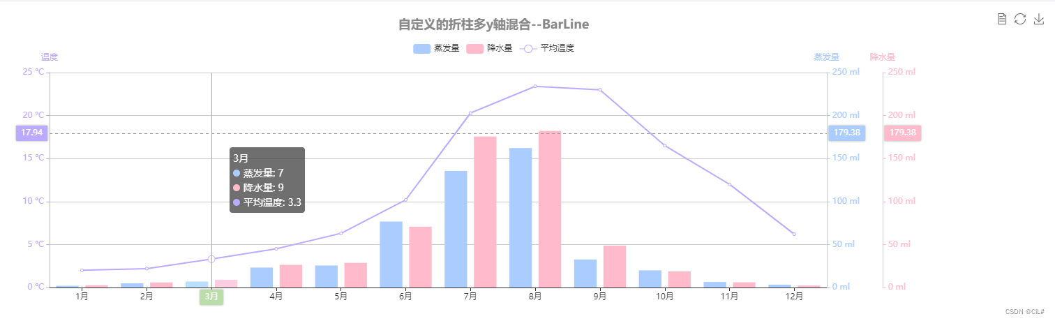
Echarts折线+柱状图的多y轴

news/2024/7/7 20:56:02 标签: echarts, 前端, vue.js

实现效果:

代码:

<template>
    <div class="test-echart">
        <div id="barLineChart" ref="barLineChart" :style="barLineStyle"></div>
    </div>
</template>
<script>
// import * as echarts from 'echarts' // 方法2 局部引用
export default {
 data () {
    return {      
      barLineStyle: { height: '460px', with: '100%' }, // echarts的样式
      // colors: ['#5793f3', '#d14a61', '#675bba'],
      barLineOption: {
        color: ['#acf', '#fbc', '#baf'],
        title: {
          text: '自定义的折柱图多y轴混合--BarLine',
          left: 'center',
          y: '10',
          textStyle: {
            color: '#888'
          }
        },
        tooltip: {
          trigger: 'axis',
          axisPointer: { type: 'cross' }
        },
        grid: {
          top: '20%',
          right: '20%'
        },
        toolbox: {
          feature: {
            dataView: { show: true, readOnly: false },
            restore: { show: true },
            saveAsImage: { show: true }
          }
        },
        legend: {
          data: ['蒸发量', '降水量', '平均温度'],
          top: '10%'
        },
        xAxis: [
          {
            type: 'category',
            axisTick: {
              alignWithLabel: true
            },
            axisPointer: {
              label: {
                backgroundColor: '#bda' // 鼠标移入x轴线对应的文字背景色
              }
            },
            data: ['1月', '2月', '3月', '4月', '5月', '6月', '7月', '8月', '9月', '10月', '11月', '12月']
          }
        ],
        yAxis: [
          {
            type: 'value',
            name: '蒸发量',
            min: 0,
            max: 250,
            position: 'right',
            axisLine: {
              lineStyle: {
                color: '#acf'
              }
            },
            axisLabel: {
              formatter: '{value} ml'
            }
          },
          {
            type: 'value',
            name: '降水量',
            min: 0,
            max: 250,
            position: 'right',
            offset: 80,
            axisLine: {
              lineStyle: {
                color: '#fbc'
              }
            },
            axisLabel: {
              formatter: '{value} ml'
            }
          },
          {
            type: 'value',
            name: '温度',
            min: 0,
            max: 25,
            position: 'left',
            axisLine: {
              lineStyle: {
                color: '#baf'
              }
            },
            axisLabel: {
              formatter: '{value} °C'
            }
          }
        ],
        series: [
          {
            name: '蒸发量',
            type: 'bar',
            data: [2.0, 4.9, 7.0, 23.2, 25.6, 76.7, 135.6, 162.2, 32.6, 20.0, 6.4, 3.3]
          },
          {
            name: '降水量',
            type: 'bar',
            yAxisIndex: 1,
            data: [2.6, 5.9, 9.0, 26.4, 28.7, 70.7, 175.6, 182.2, 48.7, 18.8, 6.0, 2.3]
          },
          {
            name: '平均温度',
            type: 'line',
            yAxisIndex: 2,
            data: [2.0, 2.2, 3.3, 4.5, 6.3, 10.2, 20.3, 23.4, 23.0, 16.5, 12.0, 6.2]
          }
        ]
      }
    }
 },
 mounted () {
   this.$nextTick(() => {
     this.getEcharts()
   })
 },
 methods: {
    // 获取趋势折线图
    getEcharts () {
      // 此处本来是直接调用接口的,这里就写点假数据

      if (this.$refs.barLineChart) {
        // 遇到数据更新,视图未更新两种解决方法 --解决echarts数据更新,页面不刷新问题
        // 1.添加 barLinecharts.clear()
        // // const barLinecharts = echarts.init(this.$refs.barLineChart)
        // const barLinecharts = this.$echarts.init(this.$refs.barLineChart)
        // barLinecharts.clear()
        // // 对实例对象进行配置
        // barLinecharts.setOption(this.barLineOption)
        // ------
        // 2. setOption有3个属性,setOption(option,notMerge,lazyUpdate);第二个notMerge默认为false,即默认合并数据,设置成true之后就不合并数据,从而实现刷新页面的效果。
        // const barLinecharts = echarts.init(this.$refs.barLineChart)
        const barLinecharts = this.$echarts.init(this.$refs.barLineChart)
        barLinecharts.setOption(this.barLineOption, true)
      }
   }
 }
}
</script>
<style lang="scss" scoped>
.test-echart {
  width: 100%;
  height: 500px;
}
</style>


http://www.niftyadmin.cn/n/5535280.html

相关文章

Hutool构建树结构

引入依赖 <dependency><groupId>cn.hutool</groupId><artifactId>hutool-all</artifactId><version>${hutool.version}</version> </dependency>测试 SpringBootTest public class HutoolTest {private List<Menu> me…

VIM介绍

VIM&#xff08;Vi IMproved&#xff09;是一种高度可配置的文本编辑器&#xff0c;用于有效地创建和更改任何类型的文本。它是从 vi 编辑器发展而来的&#xff0c;后者最初是 UNIX 系统上的一个文本编辑器。VIM 以其键盘驱动的界面和强大的文本处理能力而闻名&#xff0c;是许…

在Linux上部署和管理OpenStack云平台

部署和管理OpenStack云平台在Linux上是一个相当复杂的任务&#xff0c;涉及到多个组件和服务的配置和集成。下面是一个简化的步骤概述&#xff0c;用于在Linux上部署和管理OpenStack云平台&#xff1a; 1. 环境准备: • 确保你有足够数量的服务器作为控制节点、计算节点、网络…

鸿蒙 HarmonyOs 动画效果 快速入门

一、理论 1.1 animation属性 名称参数类型必填描述durationnumber否设置动画时长&#xff0c;默认值&#xff1a;1000&#xff0c;单位&#xff1a;毫秒temponumber否动画播放速度。数值越大&#xff0c;速度越快&#xff0c;默认为1curvestring | Curve否 设置动画曲线。 默…

【SQL】索引过多的缺点

索引并不是建得越多越好。虽然索引可以提高查询性能&#xff0c;但它们也带来了一些负面影响&#xff0c;特别是在数据修改操作&#xff08;插入、更新、删除&#xff09;和存储空间方面。以下是一些需要考虑的因素和权衡&#xff1a; 1. 写操作的性能影响 每个索引在数据修改…

Redis基础教程(四):redis键(key)

&#x1f49d;&#x1f49d;&#x1f49d;首先&#xff0c;欢迎各位来到我的博客&#xff0c;很高兴能够在这里和您见面&#xff01;希望您在这里不仅可以有所收获&#xff0c;同时也能感受到一份轻松欢乐的氛围&#xff0c;祝你生活愉快&#xff01; &#x1f49d;&#x1f49…

cpu,缓存,辅存,主存之间的关系及特点

关系图 示意图&#xff1a; ------------------- | CPU | | ------------- | | | 寄存器 | | | ------------- | | | L1缓存 | | | ------------- | | | L2缓存 | | | ------------- | | | L3缓存 | | | ------------- | ----…

详细分析Oracle修改默认的时间格式(四种方式)

目录 前言1. 会话级别2. 系统级别3. 环境配置4. 函数格式化5. 总结 前言 默认的日期和时间格式由参数NLS_DATE_FORMAT控制 如果需要修改默认的时间格式&#xff0c;可以通过修改会话级别或系统级别的参数来实现 1. 会话级别 在当前会话中设置日期格式&#xff0c;这只会影响…